
The Art of Visual Hierarchy in UX Design: Guiding User Attention
Introduction:
In the digital landscape, where every pixel counts, mastering the art of visual hierarchy is essential for creating compelling and intuitive user experiences. Visual hierarchy is the arrangement and presentation of elements in a design that influences the order in which they are perceived. By strategically organizing elements based on their importance, designers can guide user attention, improve usability, and enhance overall user experience. In this blog post, we will explore the principles and techniques of visual hierarchy in UX design and discuss how they can be leveraged to create more effective designs.
Why Visual Hierarchy Matters in UX
Imagine landing on a cluttered e-commerce site: banners screaming discounts, product grids overwhelming the screen, and tiny “Buy Now” buttons lost in the noise. You’d likely bounce off in frustration. That’s the cost of poor visual hierarchy—high bounce rates, low conversions, and unhappy users.
On the flip side, effective hierarchy streamlines decision-making. It aligns with how our brains process information: we notice the biggest, brightest, or most contrasting elements first. According to eye-tracking studies, users follow an “F-pattern” or “Z-pattern” when scanning pages, focusing on headlines, images, and calls-to-action (CTAs) before diving deeper. By leveraging this, designers can guide users to key actions, like signing up or making a purchase, improving metrics like time-on-page and user satisfaction.
In inclusive design, visual hierarchy also aids accessibility. For users with visual impairments or cognitive challenges, clear prioritization ensures critical info isn’t buried, complying with standards like WCAG (Web Content Accessibility Guidelines).
Understanding Visual Hierarchy:
Hierarchy of Importance:
- Visual hierarchy is about prioritizing elements based on their importance. This helps users quickly understand the content and navigate through the interface efficiently.
Structuring Information:
- By organizing content into clear hierarchies, designers can create a logical flow that guides users through the interface. This makes the information easier to digest and improves overall comprehension.
Creating Focus:
- Visual hierarchy helps create focal points within a design, drawing attention to key elements such as call-to-action buttons, important messages, or crucial information.
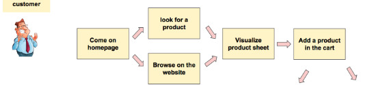
MAPPING USER JOURNEYS
Principles of Visual Hierarchy:
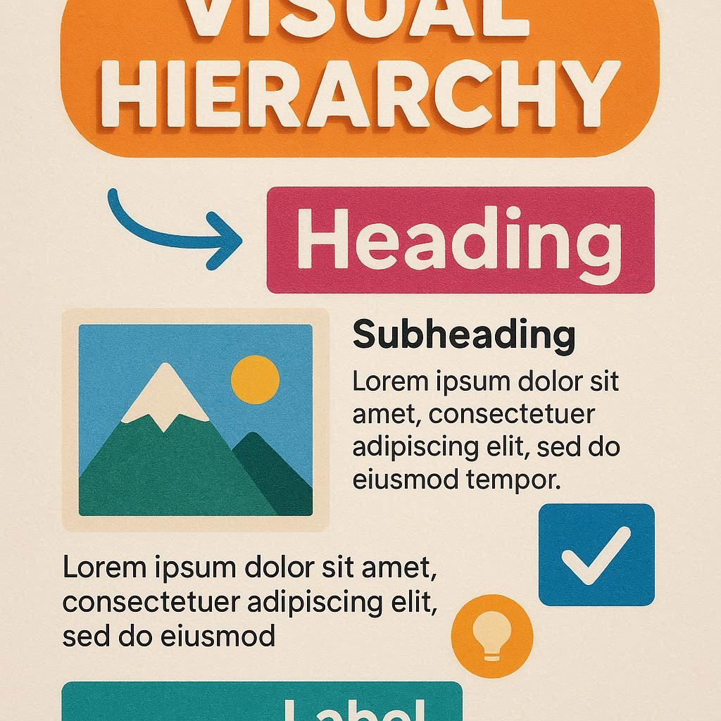
- Size and Scale:
- Larger elements tend to be perceived as more important. By varying the size and scale of elements, designers can create a sense of hierarchy and emphasis.
- Color and Contrast:
- Bright colors and high-contrast elements attract more attention. Designers can use color and contrast to highlight important elements and create visual interest.
- Typography:
- Font size, weight, and style can all be used to create hierarchy within text. Headings are typically larger and bolder, while body text is smaller and lighter, creating a clear distinction between different levels of information.
- Whitespace:
- Whitespace, or negative space, is crucial for creating a sense of balance and hierarchy in a design. By using whitespace effectively, designers can separate and prioritize elements, improving readability and visual appeal.
- Alignment and Layout:
- Alignment and layout play a significant role in visual hierarchy. Elements that are aligned with each other tend to be perceived as related, while elements that are off-center or misaligned stand out more.
Techniques for Effective Visual Hierarchy:
- Layering and Depth:
- Using techniques such as shadows, gradients, and overlapping elements can create a sense of depth and hierarchy within a design.
- Progressive Disclosure:
- Progressive disclosure involves revealing information gradually to prevent overwhelming users. By presenting information in layers, designers can guide users through the interface without overloading them with information.
- Consistency:
- Consistency is key to effective visual hierarchy. By using consistent styles, colors, and layouts, designers can create a sense of unity and coherence throughout the design.

Conclusion:
Mastering the art of visual hierarchy is essential for creating user-centered designs that are both functional and visually appealing. By understanding the principles and techniques of visual hierarchy, designers can create interfaces that guide users through the content, highlight key information, and ultimately enhance the overall user experience. Visual hierarchy is not just about making elements look pretty; it’s about creating designs that are intuitive, engaging, and easy to use. By applying these principles and techniques, designers can create more effective designs that resonate with users and meet their needs effectively.