Case Study - Swiggy Group Order
2021. | Reading Time : 20 mins
A project where I led the UX strategy and design for Swiggy Group Order, transforming how users collaborate on food orders. Through user research, wireframing, and high-fidelity prototyping, I streamlined the experience to reduce friction and enhance usability. The redesign improved order completion rates, increased user engagement, and simplified group payments, making collaborative ordering seamless and efficient
Heads up!. This case study is a bit lengthy. I share a lot about my approach and design thinking. The Navigation below will help you jump to sections
Overview
- Swiggy is one of the leading food ordering apps in India is planning for a new feature
- We have noticed an increase in orders, especially during Friday evenings
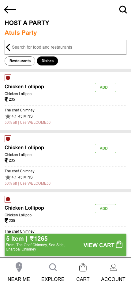
- This inspired us to come up with a group order feature for users who would like to host a party at their place
- There will be a host and there will be guests.
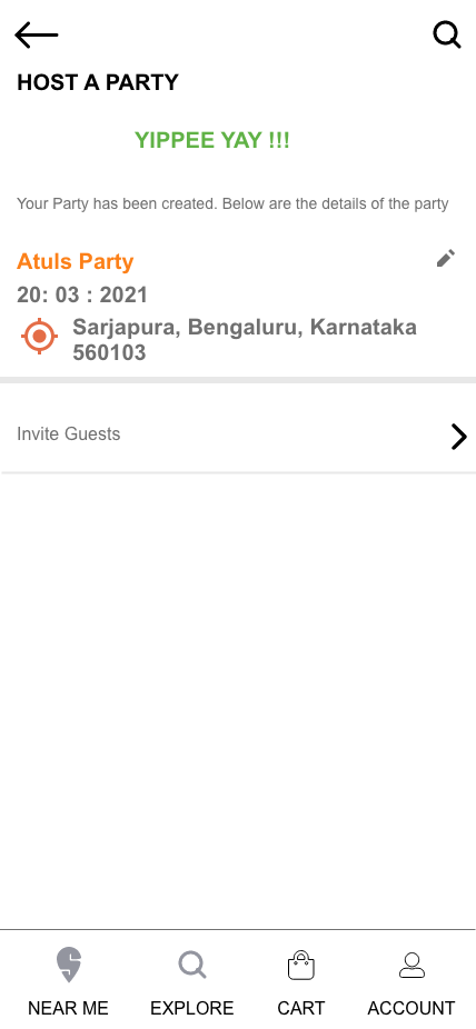
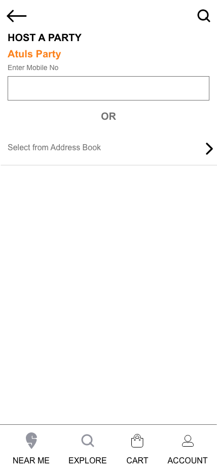
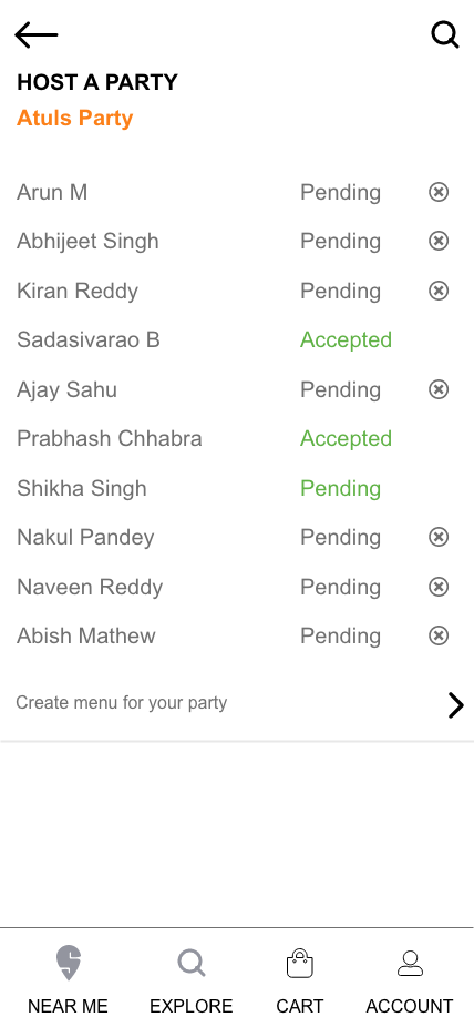
- The host will select the location where the party will be hosted and send invitation to the guests
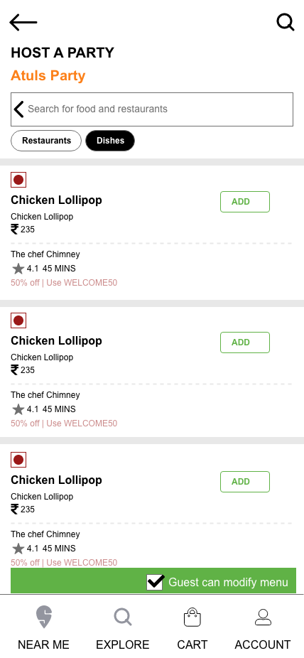
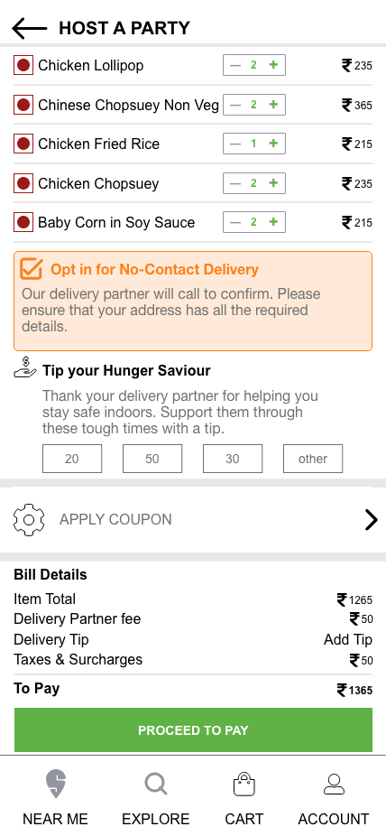
- The host will create a party menu on the app and share the menu with the guests.
- Guests too can edit the menu but only after accepting the invitation
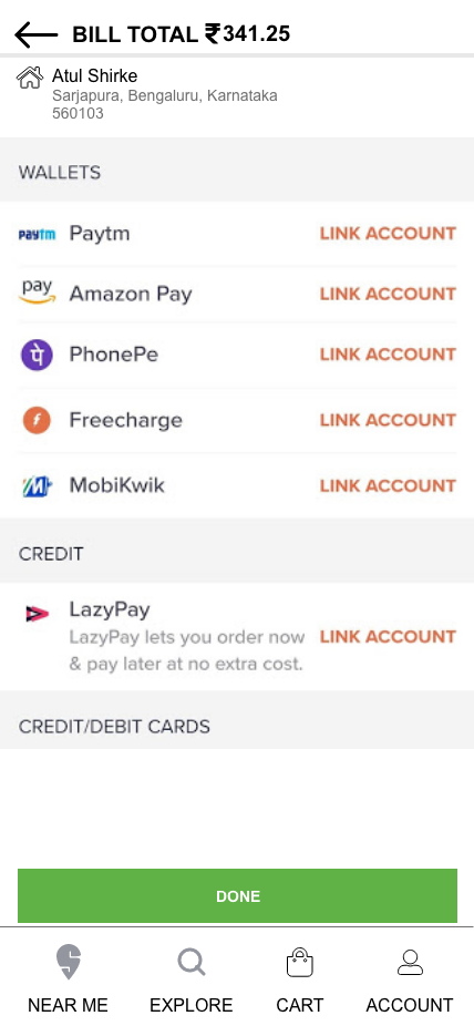
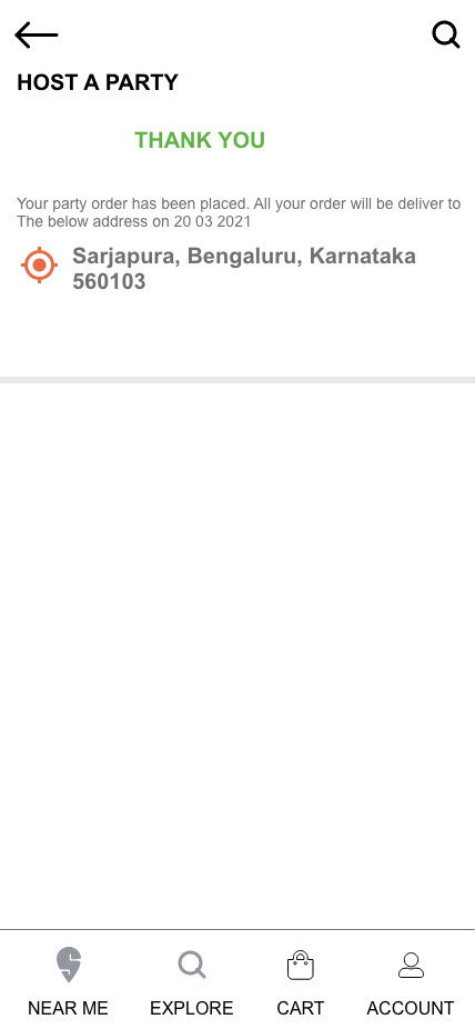
- Once the menu is finalized, the host can make the payment
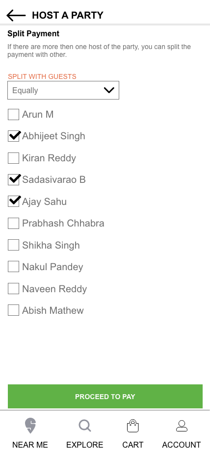
- The host can also split the payments between him and the guests.
- Food will be delivered to the party location on the designated day.
My Role
This was a design exercise that was assigned to me by a design agency. I did everything, from Requirement gathering, Stakeholder interview, User Research, User Profiling, Creating User Persona, Task Profiling to finally creating the design using Adobe Xd.
Project in Numbers
Problem Statement
- Define the user experience of group order features for Swiggy
- Envision both host and invitee experience
- Create a seamless Experience so that user does not realize the addition of new feature into their existing app.
Assumptions
The Product Owner and I made few decisions to start with. we decided that we will keep our scope only to 3-4 types of user-profiles and not overthink. we will identify the Primary User and build the initial iteration around him. we will detail out the list of features only around the Primary user. This new Group order will not be a standalone functionality and should seamlessly merge into the existing Swiggy Ecosystem. We will not put any effort into the menu and Payment. And we will treat unidirectional flow both for Host and Guest users.
Research & Competitor Analysis
I began the project with structured requirements-gathering sessions with key stakeholders. This included multiple conversations with the Product Owner to understand the context, business goals, and success criteria for the Group Order feature. Since I did not have direct access to end-users, I created a detailed user insight questionnaire, which the Product Owner circulated internally to provide clarity on user behaviors, needs, and the primary persona for this experience.
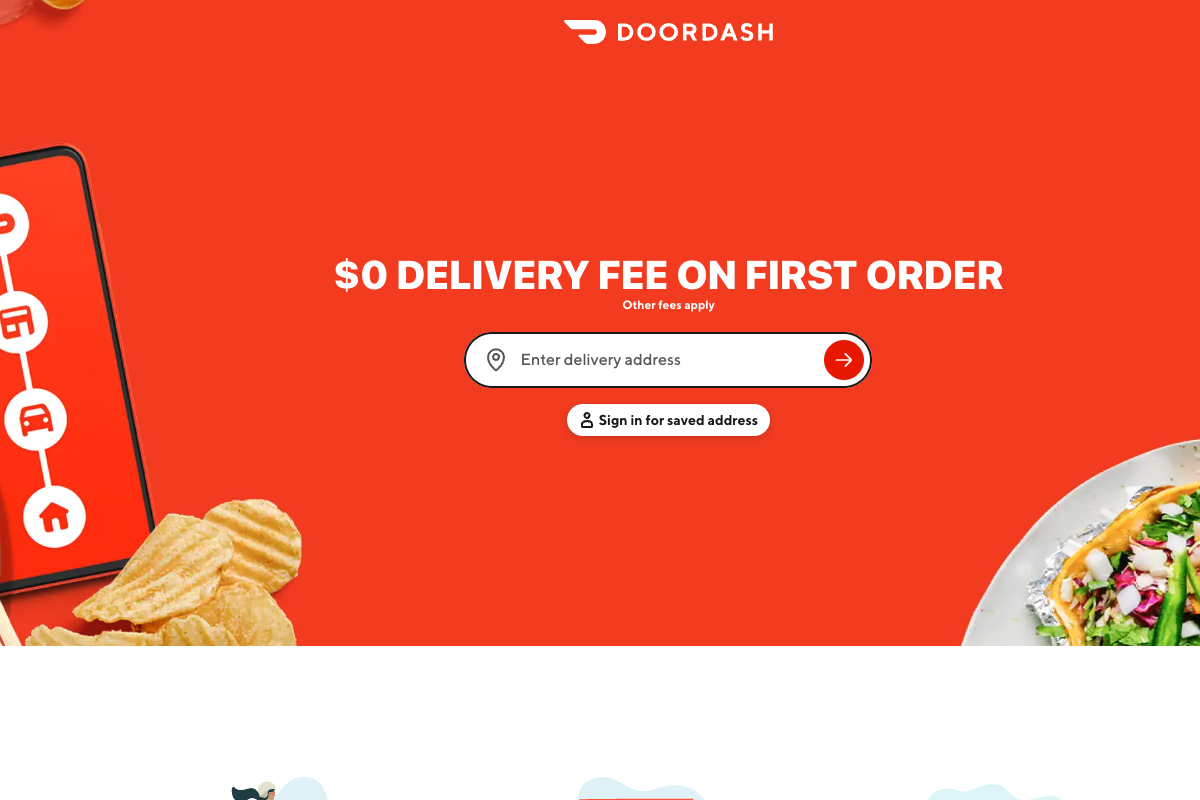
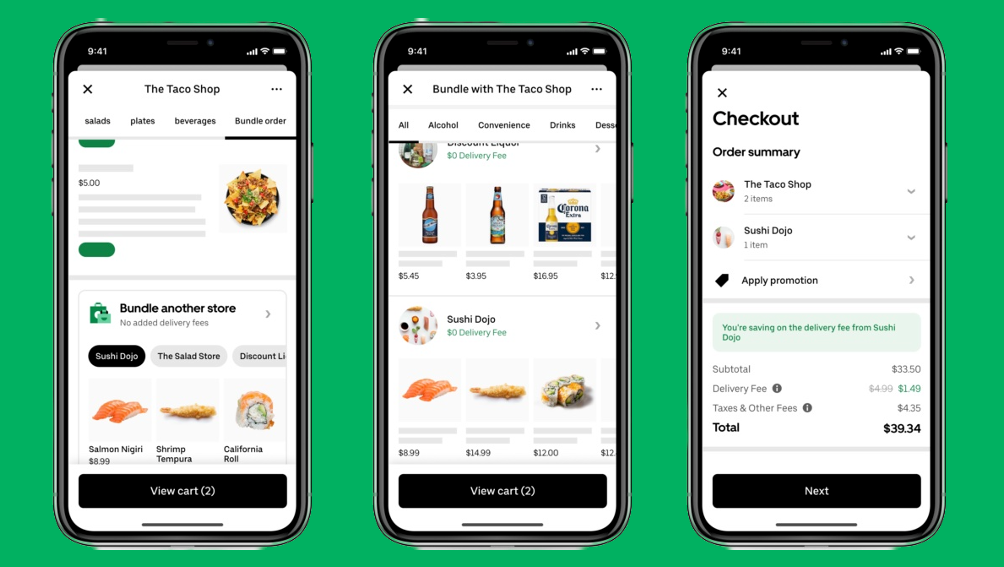
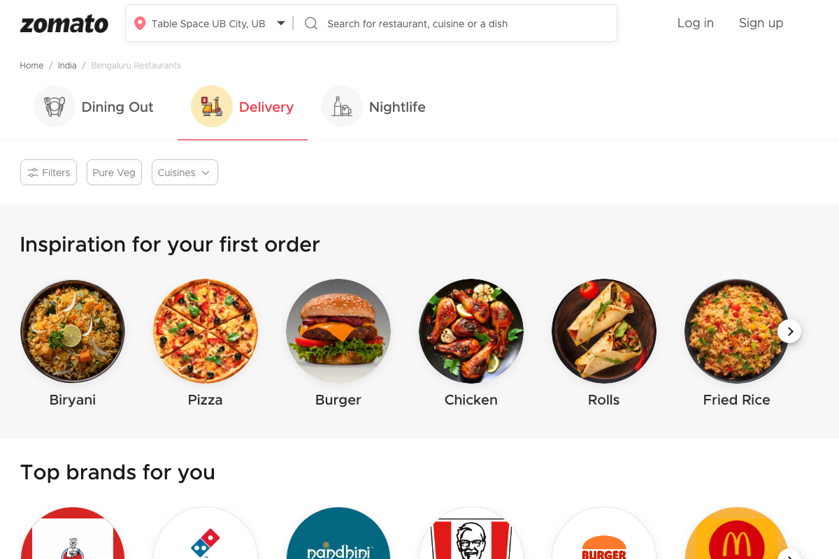
To strengthen the solution, I conducted an extensive competitive analysis across major food-delivery platforms including Zomato, Uber Eats, and DoorDash. While none of them had a true equivalent of the Group Order experience we envisioned, the audit provided valuable insights into shared cart patterns, multi-user interactions, and collaboration flows. These references informed several early design directions.
Once the primary user was clearly defined, I moved into task analysis. I documented all potential user tasks in a structured spreadsheet and reviewed them with the Product Owner and cross-functional stakeholders. After several iterations—refining tasks, validating expectations, and aligning on functional boundaries—we arrived at a validated and comprehensive task list.
With consensus established, I documented the finalized requirements and tasks in GitHub, providing a detailed breakdown that served as a foundation for design exploration and subsequent wireframes.
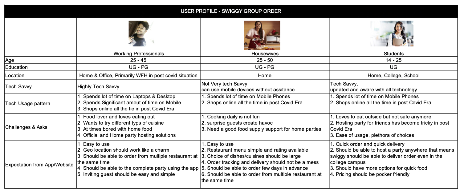
User Profiles
While working on this, I considered three Major User profiles
- Working Professional
- Housewives
- Students
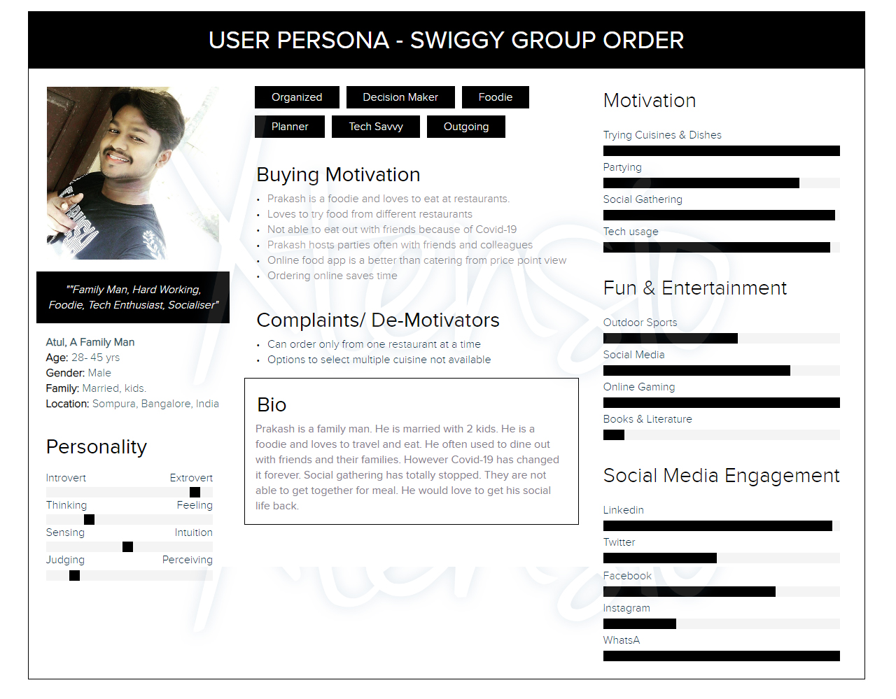
User Persona
Of the 3 user Profiles considered, we decided to target this application for Working Professional in the first design iteration. Hence we created the User Persona for Working Professional only. The Goal was to take a deep insight in his requirement, challenges, asks, behaviour and design the product around him. Initial Market Survey suggested that more then 60% of the user of this product would be Working Professionals.
Task Profile
- Here is the list of task that has been identified for this Case Study.
- All the task has also been detailed out on Github.
- Task Profile
Tools Used
Discover
- Competitor Analysis
- User interview
- Market Research
- User Research
- User Profile
- User Persona
Define
- Business Requirement Documentation
- Gitlab – Product Backlog
- Conceptdraw Mind Map – I.A
Design
- Pencil Evolus
- Adobe XD
Design
View in full screen for a better quality of the image
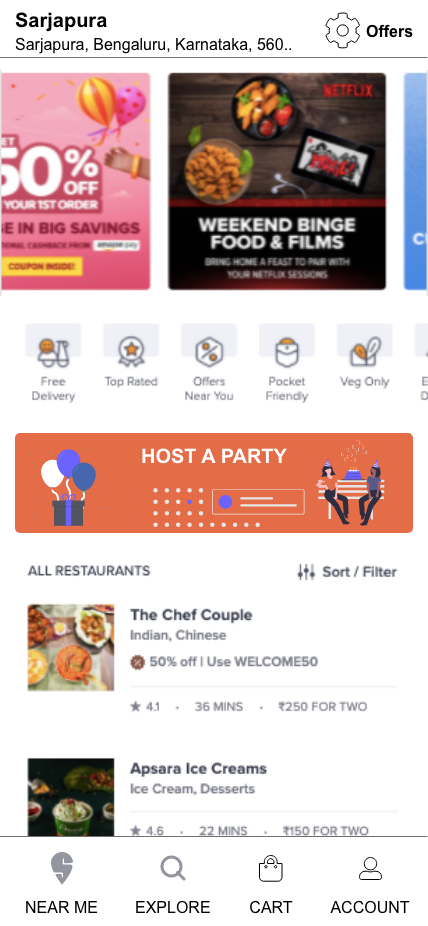
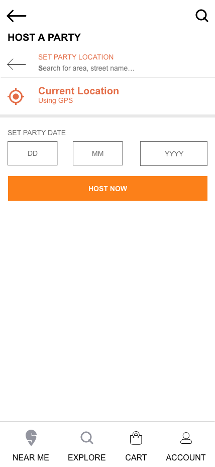
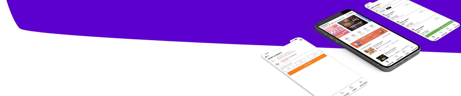
Prototype: Host UI
Prototype: Guest UI
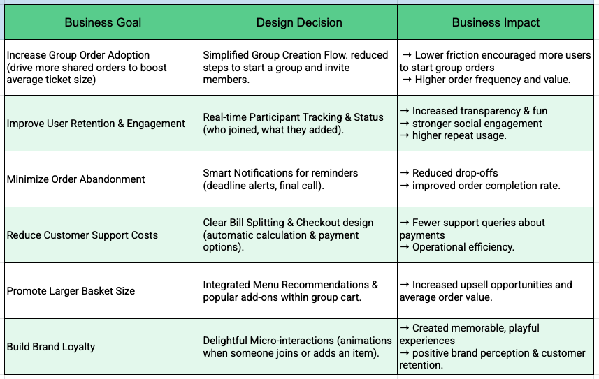
Aligning Business Goals to Design Decisions
Lessons Learned
Swiggy group order was unique in many ways. At the peak of pandemic, working on this product line was a different ecosystem to deal in. Here are my top 5
- Even in post pandemic world, User Experience is still king. You need to talk to them.
- Think slow, User expectations could be different from your anticipation
- Remote interview in the pandemic world has new challenges. Understand well. Prepare better
- Even the most complex product should be designed to work simply.
- Loopback with the user after the interview
Final Words
Swiggy Group order was an interesting project to work on. it started with a very thorough understanding of the user. In the absence of actual users, I had multiple calls with the product owner. Requirement gathering and finalization of the requirement were very interesting. It led to many heated discussions but in the end, we all agreed on what we want and how we wanted to build. The whole exercise was completed in a week’s time. I spend 3 to 4 hours daily working on this project. There are multiple iterations of requirements, user profiles and personas, low fidelity prototypes, and design.