
Why Your Analytics Tools Are Wrong for UX Metrics
Analytics tools like HotJar, Pendo, Google Analytics, Amplitude, Mixpanel, and Adobe Analytics promise deep insights into user behavior. New tools launch regularly, each claiming to unlock groundbreaking understanding of how users interact with your product. Yet, despite their best intentions, these tools often fall short for UX metrics. As UX leaders, we need to move beyond their limitations to measure what truly matters: the quality of our users’ experiences and the impact of our designs.
The Problem with Out-of-the-Box Analytics
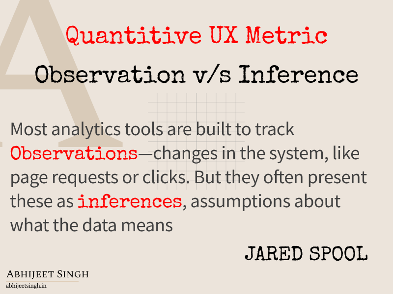
Most analytics tools are built to track observations—changes in the system, like page requests or clicks. But they often present these as inferences, assumptions about what the data means. For example:
Bounce rate: Tools infer a “bounce” when no further data is recorded, but different platforms measure it inconsistently. It doesn’t directly tell you why users left.
User visits: Tools count HTTP page requests and infer these equal visits, but this can misrepresent actual user engagement.
Conversion rates: A 100% conversion rate assumes everyone should convert, ignoring that some users may have no intent to purchase.
These inferences can mislead. Heatmaps, for instance, often distort data with misleading color thresholds, where a single click can shift a region from “cold” to “hot.” Without understanding user intent or context, these metrics fail to capture the full story of the user experience.

The Risks of Inference-Based Metrics
When teams use these flawed inferences for critical decisions, like setting Objectives and Key Results (OKRs), they risk chasing unattainable or misleading goals. For example, aiming for a 100% conversion rate ignores users who visit for information, not purchase. Without knowing user intent, you can’t set realistic targets—or know if you’re already meeting them.
Starting with the tool’s available metrics is a common trap. Instead of asking, “What change do we want to see in our users’ lives?” teams ask, “What can we measure with this tool?” This backward approach leads to metrics that don’t reflect the true impact of design decisions.
A Better Approach: UX Metrics Grounded in User Experience
To create meaningful UX metrics, start with a deep understanding of your users’ current experiences. Qualitative research—observing user behaviors and identifying pain points—lays the foundation. From there, you can define:
UX Success Metrics: These measure how your design improves users’ lives. For example, if users struggle to find a feature, a success metric might track reduced time to complete that task.
UX Progress Metrics: These show how close you are to achieving success, such as fewer instances of a specific problem or increased feature adoption.
Problem-Value Metrics: These highlight the hidden costs of poor UX, like increased support calls or customer churn, making a case for investment in better design.
These metrics often require custom analytics tailored to patterns observed in qualitative research. While off-the-shelf tools may not capture these directly, you can still track changes through qualitative sampling or by building custom data collection. For example, if research shows users abandon a process due to confusion, you can observe whether that issue becomes more or less frequent after a redesign.
Avoiding Common Traps
To ensure your UX metrics are effective:
Distinguish observations from inferences: Be clear about what your tools are directly measuring versus what they’re assuming. Avoid setting goals based on shaky inferences without rigorous data science.
Start with user experience, not tools: Define the changes you want to see in users’ lives, then figure out how to measure them—whether with existing tools or custom solutions.
Focus on outcomes: Translate pain points into measurable improvements. For instance, if users find onboarding complex, track metrics like time to onboard or error rates.
Building a Persuasive UX Metrics Strategy
Effective UX metrics amplify the story of your work, showing stakeholders how design improves lives and drives business value. By focusing on UX outcomes—success, progress, and problem-value metrics—you can create a shared understanding of user behavior and avoid the pitfalls of generic analytics. This approach not only sets realistic goals but also demonstrates the tangible benefits of prioritizing UX.