
The Psychology of Color in UX Design: Enhancing User Engagement
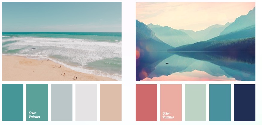
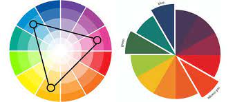
Color is a silent but powerful communicator, influencing emotions, perceptions, and behaviors. In the realm of user experience (UX) design, understanding the psychology of color is a potent tool for creating interfaces that not only look appealing but also engage users on a deeper level. In this blog post, we will explore how the psychology of color impacts user engagement and discuss strategies for leveraging color effectively in UX design.

The Emotional Palette:

Red: Passion and Energy
Red, a dynamic color, is linked to passion, energy, and urgency. It effectively grabs attention, signals importance, and evokes strong emotions. However, its impactful nature requires judicious use, as it can be perceived as aggressive.”.
Blue: Trust and Stability
Blue is often associated with trust, stability, and calmness. It’s a versatile color that works well in a variety of contexts. Lighter blues can create a serene atmosphere, while darker blues convey professionalism and reliability.
Green: Freshness and Growth
Green is linked to nature, freshness, and growth. It’s commonly used in environmental or health-related contexts. Darker greens can convey wealth and stability, while brighter greens evoke feelings of renewal and vitality.
Yellow: Optimism and Clarity
Yellow is a bright, attention-grabbing color associated with optimism and clarity. It can be used to highlight important elements or bring warmth to a design. However, too much yellow can be overpowering.
Purple: Luxury and Creativity
Purple is often associated with luxury, creativity, and sophistication. It can be used to add a touch of elegance to a design. Lighter purples can have a calming effect, while darker shades convey richness.
Orange: Friendliness and Energy
Orange is a vibrant and friendly color associated with energy and enthusiasm. It can be used to create a sense of warmth and playfulness. Like red, it’s attention-grabbing, but in a more approachable way.
Strategies for Effective Color Use in UX Design:

Consider Cultural Context:
Be mindful of cultural associations with colors. Colors can have different meanings in various cultures, so it’s essential to consider the global audience of your design.
Create Visual Hierarchy:
Use color to establish a visual hierarchy, guiding users’ attention to the most important elements on the page. Bold or contrasting colors can be employed for call-to-action buttons or critical information.
Maintain Readability:
Ensure that text remains legible against the background color. High contrast between text and background is crucial for readability. For example, dark text on a light background or vice versa.
A/B Testing:
Conduct A/B testing with different color schemes to determine which resonates best with your target audience. Data-driven insights can help refine your color choices based on user preferences.
Consistency Across Branding:
Maintain consistency with your brand’s color palette. Consistent use of colors across various touchpoints reinforces brand identity and fosters a cohesive user experience.
Accessibility Matters:
Consider accessibility by ensuring that color choices accommodate users with visual impairments. Provide sufficient contrast and alternative cues for users who may have difficulty distinguishing certain colors.
Conclusion:
“The intricate realm of color psychology in UX design serves as a potent and multifaceted tool, surpassing mere aesthetics. Purposeful color selections hold the sway to mold users’ emotions, guide their interactions, and elevate the overall experience. By delving into the psychological impact of diverse colors and implementing strategic design principles, designers can orchestrate interfaces that not only arrest attention but also establish a profound and meaningful connection with users.”


